Our brand mark
The Satair logo
The logo reflects our essence, our spirit and our personality. It is frequently our organization’s main identifier.
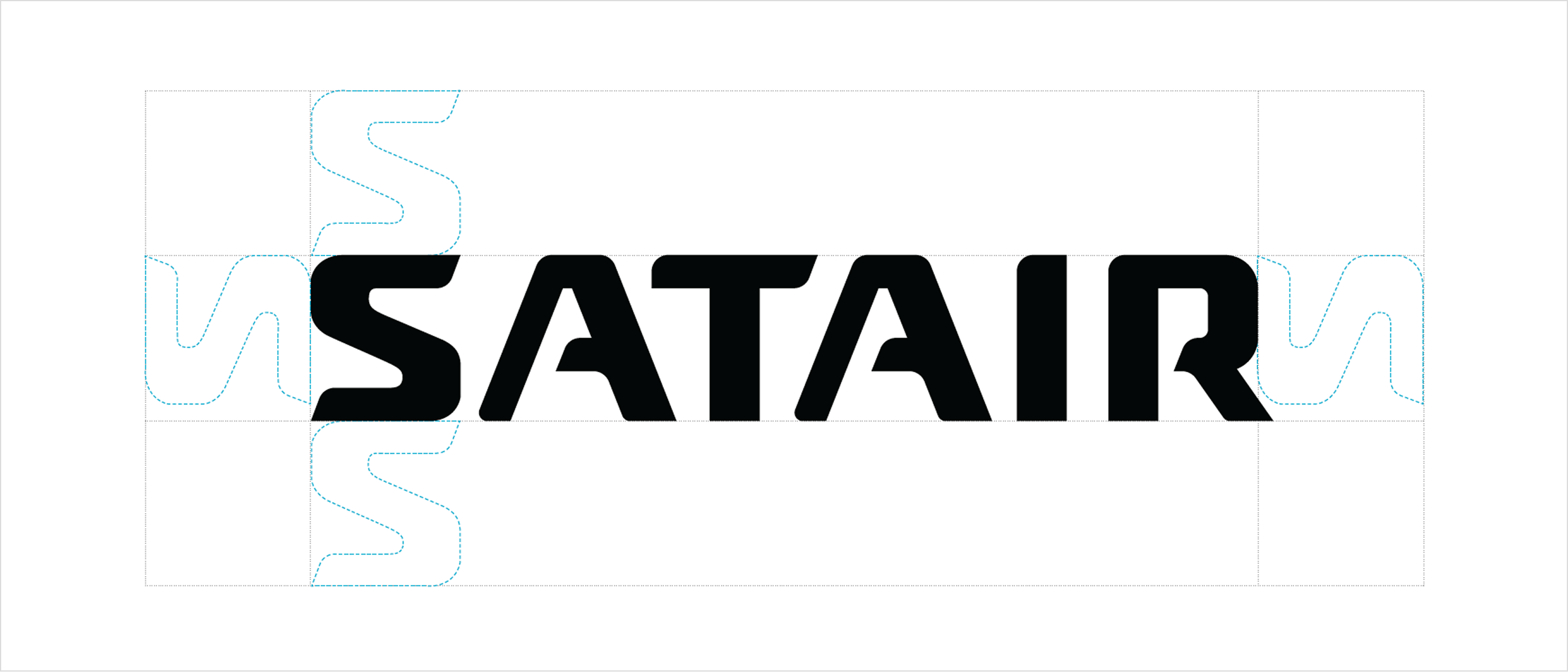
Clear space/Protection area
The logo should always have a prominent position and should not be competing with other graphical elements for space. There should always be a minimum distance to other elements equal to the height of the S in the logo.
Logo variations
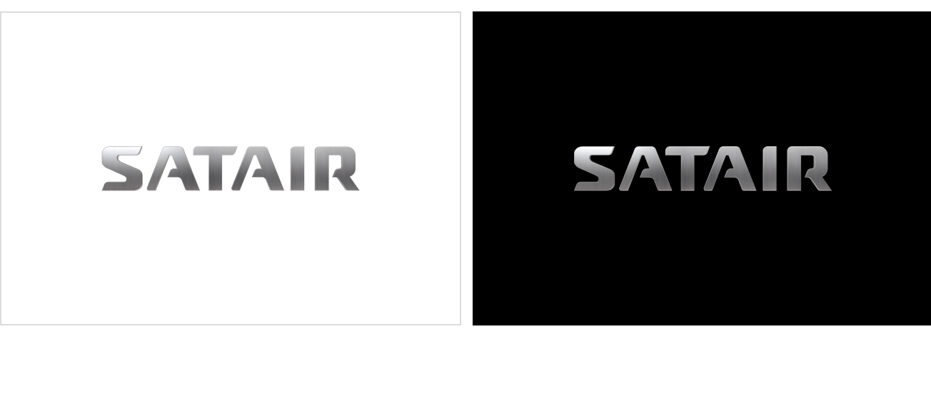
Positive version
There are two positive versions of the logo. One in black and one in brushed steel. In cases where the Satair logo is applied on a white or pale background the positive versions should be used.
Negative version
In the cases where the Satair logo is applied on a black or dark background, the negative version will be used.
Download the logo package:
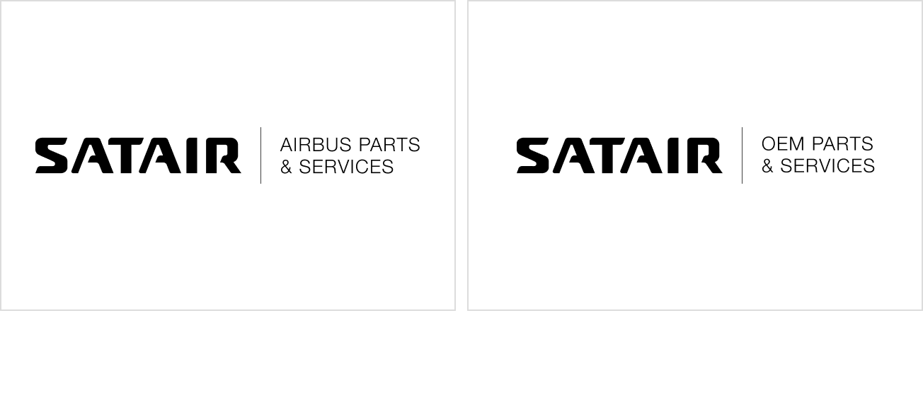
Channel specific versions
The Channel Specific versions should only be used in situations where it is required externally to explain that a product and/or service is solely related to one trading entity (either Airbus or Satair) or in cases when we are serving the customer via two different channels out of the same customer facing organization (i.e. Airbus COD and Satair COD). In all other cases, the standard Satair logo should be used.
Incorrect Usage
Do not alter the logo. Avoid the following treatments.
Do not use against a background that makes it difficult to see the logo.
Do not distort the elements comprising the logo.
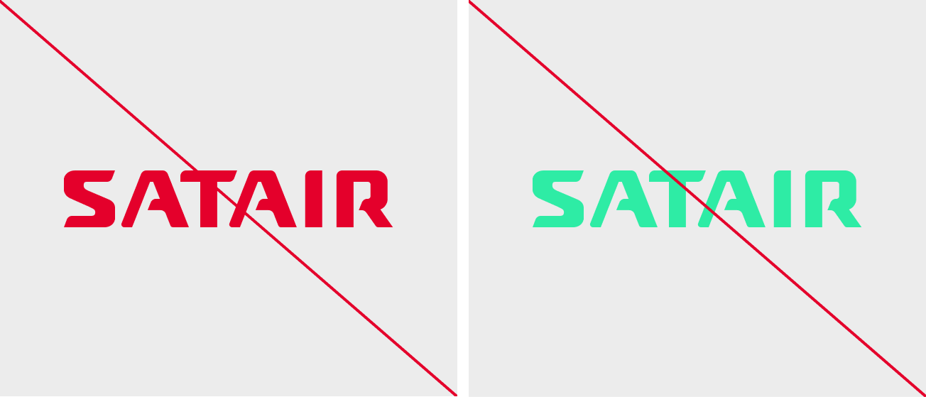
Do not use any other color than black or white.
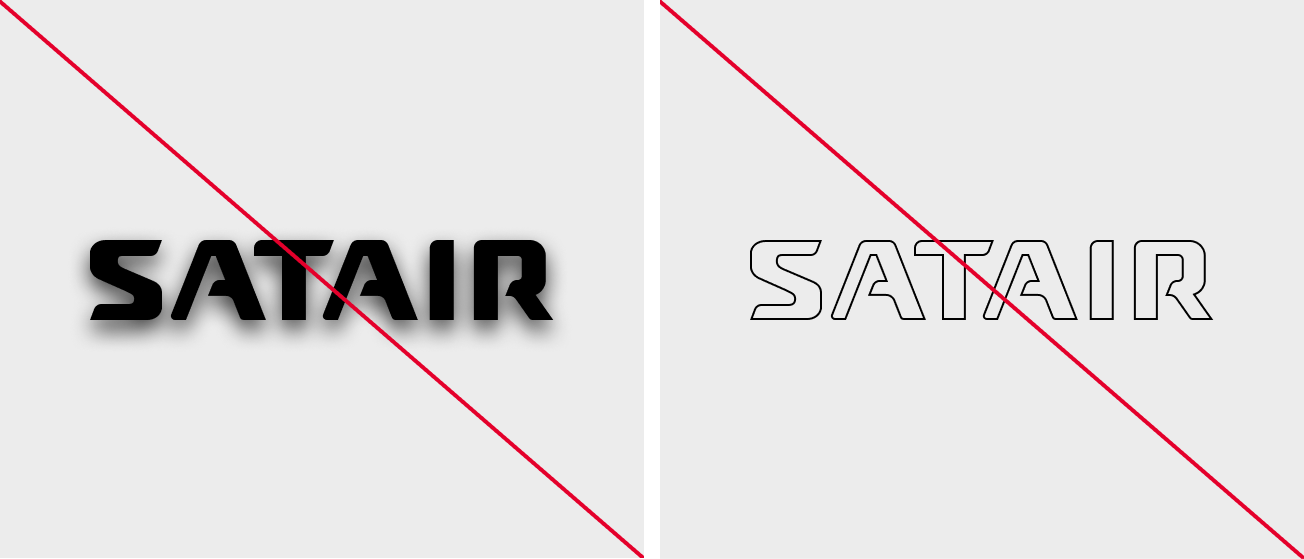
Do not apply effects & Do not outline.
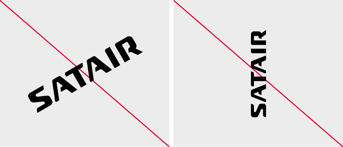
Do not position on an angle.
Brand guideline access & assistance
We’re here to help. Reach out to brand@satair.com.